


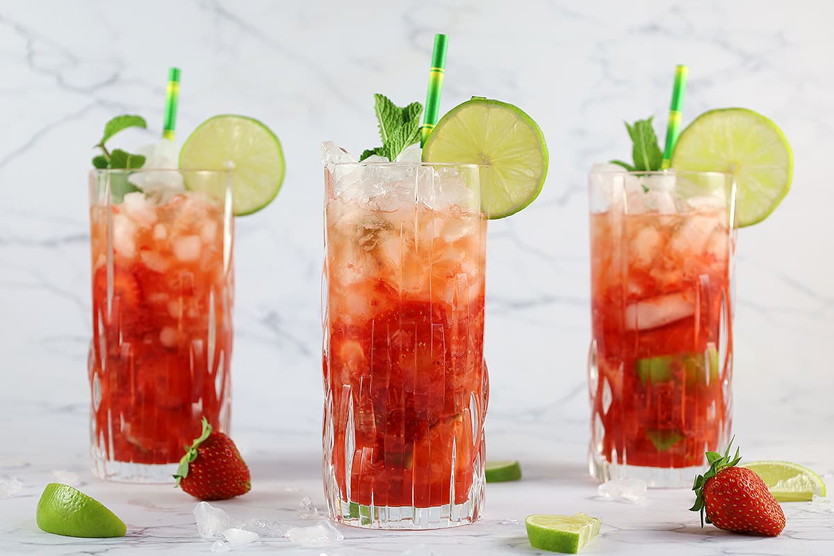
Food photos have one job: make someone hungry.
And then we compress them, upload them, and they come out looking… resigned. The croissant loses its flake. The soup loses its steam. The highlights go dull. Suddenly your “you need to make this tonight” recipe photo turns into “this was taken under office lighting in 2009.”
The frustrating part is that recipe sites genuinely need compression. Food blogs are image-heavy by nature: process shots, ingredient spreads, finished dish hero images, step-by-step collages. If you don’t optimize, pages load slowly, mobile users bounce, and your beautiful work gets stuck behind a loading spinner.
So the goal isn’t to avoid compression. The goal is to compress in a way that keeps the “yum factor” intact: crisp texture, appetizing color, and that glossy highlight that makes a sauce look alive.
This guide walks you through a simple, repeatable workflow that speeds up your recipe pages using WebP and smart compression, without turning your photos into melancholy leftovers.
Why food photos get “sad” after compression
Food photography is uniquely vulnerable to “looks worse after optimization” because it relies on subtle detail. The human brain is extremely sensitive to texture and color when it comes to food. You can compress a landscape pretty aggressively and most people won’t mind. Compress a brownie and suddenly it looks like a sponge.
What typically breaks first (texture, steam, highlights, bokeh)
Texture is usually the first casualty. Think flaky pastry layers, crispy edges, crumb structure, herb detail, and tiny glints of oil. These details live in fine patterns that compression loves to blur or smear.
Steam is another. Steam is basically delicate, semi-transparent detail against a background. Heavy compression turns it into noise or removes it entirely, which makes food look colder and less fresh.
Highlights matter more than most people realize. The shine on glaze, the gleam of a spoonful of soup, the gloss on roasted vegetables. Compression can flatten highlights, making food look matte and less appetizing.
And then there’s bokeh. Soft backgrounds are supposed to look smooth. Compression can add weird blockiness or banding, which makes the image feel cheap even if the subject remains sharp.
Color shifts and why salads suffer more than brownies
If you’ve ever compressed an image and thought, “Why does this look slightly… off?” you’re not imagining it. Color shifts happen when compression interacts with subtle tones, especially in greens.
Salads suffer more than brownies because greens contain a lot of fine variation: leaf texture, highlights, tiny hue changes between different ingredients. Compression can push greens toward muddy, unnatural tones or create blotchy patches that look like bruising.
Brownies, by contrast, are more forgiving. Deep browns hide small artifacts. A little loss in subtle shading doesn’t scream at the viewer the way a sad, gray-green basil leaf does.
The takeaway isn’t “don’t compress salads.” It’s “treat greens gently and test them.”
Over-sharpening and crunchy noise
A common panic response to compression softness is sharpening. The problem is that sharpening after compression can create halos, crunchy noise, and a brittle look, especially around edges like plate rims, cutlery, or herb sprigs.
Food photos should feel natural and inviting. Over-sharpening makes them feel harsh, like the food is made of plastic or the kitchen is lit by lasers.
If you need sharpness, it’s better to protect detail through smart export choices than to try to rescue it with aggressive sharpening later.
A quick prep routine before exporting
Before you even think about WebP or compression, there’s a quick prep routine that makes everything easier. It’s the difference between “compress and pray” and “compress with confidence.”
Crop and straighten for consistent aspect ratios
Recipe sites look better and load better when images are consistent.
If your hero images are all slightly different aspect ratios, your layout has to jump around. That creates visual mess and can contribute to layout shift, especially on mobile.
Choose a couple of standard aspect ratios for your site and stick to them. Common patterns are 4:5 for tall images, 1:1 for square grids, and 3:2 or 16:9 for wider hero banners. The exact choice matters less than the consistency.
Straighten while you’re at it. A slightly tilted countertop can make a dish look oddly unstable, and it’s surprisingly noticeable once it’s on a page.
Fix exposure and white balance once, not on every size
The best time to fix exposure and white balance is before you create multiple sizes.
If you export multiple versions and then tweak each one, you end up with inconsistent color across your site. Your “same recipe” images start to look like they were shot in different kitchens.
So do your exposure and white balance adjustments once in your master image. Then create your derivatives (WebP sizes, thumbnails, etc.) from that consistent master.
This also helps compression, because stable tones and controlled highlights compress more cleanly than wildly varied exposure.
Remove unnecessary metadata
Metadata isn’t always huge, but it’s often unnecessary for web display. Location data, device details, editing history. It’s not usually helping your reader decide whether to make the recipe.
Removing metadata can slightly reduce file size and can also be a privacy win, especially if photos were taken in a home environment.
Think of it as tidying the pockets before you pack a suitcase.
WebP basics for recipe photography
WebP is a modern image format designed to reduce file size while keeping quality high. For recipe sites, it’s often a sweet spot: smaller files than JPEG or PNG with very little visible downside when exported well.
When WebP beats JPEG and when it doesn’t
WebP often beats JPEG for web delivery because it can achieve similar quality at smaller file sizes, especially for photos. That means faster load times, lighter pages, and happier mobile readers. You can easily compress the images from your camera to webp online.
But WebP isn’t automatically better in every single case. Some images, especially those with very subtle gradients or fine noise patterns, might look slightly better at a similar file size in JPEG depending on settings and encoders.
The practical approach is: use WebP as your default for food photos, but don’t be afraid to keep JPEG if a specific image looks better after testing.
Choosing quality settings that keep texture and gloss
For food photography, texture and gloss are the first things you want to protect. That means choosing a quality setting that doesn’t smear micro-detail.
Instead of thinking “how low can I go,” think “how low can I go before the food stops looking delicious.” The moment herbs start to blur into green mush or highlights lose their sparkle, you’ve crossed the line.
A good habit is to export at a reasonable quality, then check three areas at 100% zoom: a textured area (crumbs, herbs), a glossy highlight (sauce, oil), and a soft background (bokeh). If all three look good, you’re safe.
Handling transparency and overlays
Most food photos don’t need transparency. If you’re adding overlays (like text banners or step labels), it’s usually better to do that in your page design rather than baking text into images, because text inside images can get fuzzy after compression and becomes less accessible.
If you do need transparency for certain graphic elements (like badges or cutouts), WebP can handle transparency, but those assets should be tested carefully for edge halos and crispness.
Compression that keeps the “yum” factor
Compression is where the magic happens, and also where people get burned. The trick is to compress with a chef’s instincts: preserve what matters, trim what doesn’t.
Avoiding banding in gradients (plates, backgrounds)
Banding is the enemy of clean food photography. It shows up in plates, studio backdrops, and softly lit backgrounds. Smooth gradients turn into visible steps, and suddenly your image looks like it’s been posterized.
To avoid banding, don’t compress gradients too aggressively. Slightly higher quality settings can solve it. In some workflows, a tiny amount of controlled grain can actually help gradients compress more naturally by breaking up perfectly smooth transitions, but that’s more advanced and not always needed.
The easy solution is simply: if you see banding, increase quality slightly and re-export.
Protecting micro-detail (herbs, crumbs, grill marks)
Micro-detail is what makes food feel real.
Herbs, crumbs, grill marks, flaky pastry, salt crystals, pepper specks. These are the signals that tell the brain “this is fresh” and “this has texture.”
If compression smears these details, the food looks flatter and less appetizing. So whenever you test an export, zoom into these details. If they hold up, your audience will feel the difference even if they can’t explain it.
Keeping skin tones natural in hands and faces
Recipe photos often include hands, faces, or people in the frame, even if only partially. Compression can mess with skin tones quickly, especially under warm kitchen lighting.
The safest approach is to avoid pushing saturation too hard in editing, then compress gently enough that skin remains natural and gradients remain smooth. If skin starts to look blotchy, that’s a sign your compression is too aggressive.
Responsive image setup for real page speed gains
WebP helps, but the biggest speed gains often come from delivering the right size image to the right device.
Generating multiple sizes for different devices
A recipe hero image that looks great on desktop might be far too large for mobile. If your site sends the same large image to everyone, you’re making mobile users download unnecessary pixels.
Generating multiple sizes allows the browser to choose the smallest version that still looks sharp on that device. It’s one of the most effective ways to reduce page weight without sacrificing quality.
Using srcset and sizes without guesswork
The goal of srcset and sizes is to help the browser make smart decisions. If you set them up properly, the browser won’t download a huge image when a smaller one will do.
You don’t need to guess every device size. You just need to align with your theme’s layout: what widths your images actually display at in the hero, in the body, and in thumbnails. Once you know that, you can generate a handful of sensible breakpoints and let the browser do the rest.
Preventing layout shift with width and height attributes
Nothing makes a recipe page feel janky like images popping into place and pushing text around. That’s layout shift.
Adding width and height attributes helps the browser reserve space before the image loads, so the page doesn’t jump. It’s a small technical detail that has a big effect on perceived quality and trust.
Common recipe-site pitfalls that slow everything down
Even with good exports, a few common site patterns can quietly sabotage speed.
Hero images that are bigger than needed
Hero images are often uploaded at massive dimensions “just to be safe.” But huge images slow down the first meaningful paint of your page. If your hero is the largest element, it often defines how fast the page feels.
Right-size your hero images for your layout, then compress with care. This is the single most impactful change on many recipe pages.
Sliders and galleries with lazy-loading mistakes
Sliders can be heavy because they often load multiple large images immediately, even if users only see one at a time. Some implementations also lazy-load incorrectly, meaning the visible image doesn’t load promptly while off-screen images do.
If you use sliders, make sure the first image loads eagerly and the rest are genuinely deferred.
Plugin “optimizers” that double-compress
This is a big one. You compress images yourself, upload them, and then a plugin compresses them again. The file gets smaller, but quality gets noticeably worse.
Double-compression is the fastest way to make food photos look sad. If you use an optimizer plugin, decide where compression happens and do it in one place, with one controlled pass.
A simple checklist to validate quality and speed
The fastest way to keep this workflow sustainable is to validate with a few simple checks that catch the common failures.
Visual QA at 100% and 200% zoom
Check texture details, highlights, and gradients at 100%. If the image includes micro-detail or text overlays, check at 200% too. You’re looking for smearing, halos, and banding.
If it passes those checks, it will almost certainly look great in real use.
Test on mobile on a weak connection
Open your recipe page on your phone using mobile data, ideally somewhere with a less-than-perfect signal. This is the real world. If it feels fast there, it will feel fast almost everywhere.
Also watch for the “first impression” moment: does the hero image appear quickly, or does the page feel incomplete for too long?
Track results with Core Web Vitals
Finally, measure. You don’t need to obsess, but you do want to see that your optimizations are actually improving speed. Core Web Vitals help translate technical changes into user experience changes: load speed, responsiveness, and stability.
When food photos are optimized correctly, the page feels more confident: it loads smoothly, looks crisp, and keeps attention where it belongs, on the recipe.


There aren't any comments left behind yet you can be the very first to comment!